 Well the Doc opened up the old mailbag today and here’s what poured out.
Dear Dr. Ads,
There I was, minding my own business and plowing through the Sunday New York Times, when I came across this on page 7.
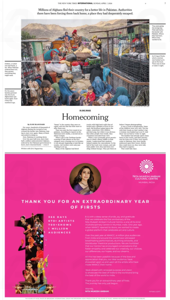
Honest to God, Doc – I had to take out a magnifying glass to read the body copy, and even then it was blurry. Who in her right mind (lookin’ at you, Nita Mukesh Ambani) would sign off on a mess like that?
– Read ‘n’ Weep
Dear RW,
First off, just to be, um, clear: The ad that appears in the Replica Edition of the Times is marginally sharper than the print version.
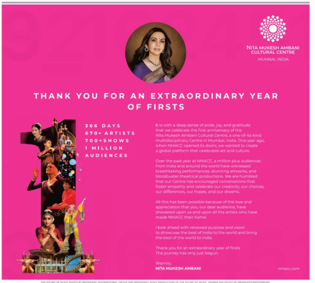
Even so, it’s still ridiculously hard to read. That’s because it violates every tenet of legendary adman David Ogilvy’s rules for effective ad copy.
Use eye-easy typography. Text set in all-caps is extremely difficult to read… sans-serif fonts are particularly difficult to read…reverse type is almost impossible to read.
Reverse type on a rose background is even more impossible to read.
The Doc’s diagnosis: The Nita Mukesh Ambani Cultural Centre in Mumbai seems like a happening place. It just needs a new art director.
